
کافیشاپ اسپریس
معمار: هوبا طرح (هومن بالازاده)
موقعیت: تهران، ایران
تاریخ: 1393
مساحت: 28 مترمربع
وضعیت: ساختهشده
کارفرما: امیر درخشی
مسئول طراحی: الهام سیفی آزاد
تیم طراحی: نیلوفر آلطه، نوشین عطروش
مدلسازی و تصویرسازی سهبعدی: مونا رضوی
مجریان نصب آجر: علی اکبری، نصرتاله منصوری
مجریان برق: محمد فرد، مجید کمالی
طراح لوگو: علیرضا انوشفر
عکس: پرهام تقیاف
جوایز: رتبه اول ﮔﺮوه ﺳﺎﺧﺘﻤﺎنﻫﺎي تجاری جایزه معماری داخلی 1393


بازسازی یک مغازه کارتفروشی و تبدیل آن به یک کافیشاپ به متراژ 28 مترمربع، چالشی برای شروع این کار بود. با توجه به کوچکی فضا و محل پروژه که مرکز فروش صنایع دستی ایران در تهران است، ما با چالشی روبهرو بودیم که بتوانیم ایدهای را برای طراحی ایجاد کنیم که اولا جوابی برای کوچکی فضا و همچنین، ایجاد هماهنگی با بافت شهری پروژه باشد و در کنار این، بتواند کیفیتی از صنایع دستی ایرانی در فضای داخلی پروژه به وجود آورد. بر اساس این مشخصات، ما سعی کردیم به همراه پرداختن به دیاگرام فضایی پروژه، ایده متریالی طرح را به گونهای طراحی کنیم که از بیرون به درون پروژه، یک ایده یکپارچه دیده شود.

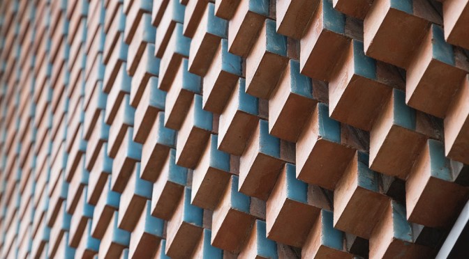
با توجه به آنکه این بنا روبهروی ساختمان مرکزی صنایع دستی ایران که یک ساختمان آجری است، قرار گرفته، ما از آجر برای شکلدهی فضا استفاده کردیم، ولی با توجه به کوچکبودن فضا، آجر را به ابعاد ریزتر تبدیل کردیم، به گونهای که یک آجر 20 در 10 در 5 را به هشت قطعه 5 در 5 در 5 تبدیل کردیم و سپس یک ضلع آن را لعاب دادیم. بنابراین، متریال پروژه بر اساس این مدل آجر شکل گرفت (terracotta با لایه ضدباکتری روی آن) که از نظر بهداشتی نیز جوابگوی نظافت دیوارهای کافه بود.

در ابتدا، وقتی ما از وضع موجود بنا بازدید کردیم، با یک سقف کوتاه در حدود 2 متر ارتفاع و با یک نیمطبقه کوتاهتر در حدود 1/5 متر ارتفاع روبهرو شدیم. با توجه به وضعیت بنا، دیاگرام فضایی طرح میبایست مشکلات وضع موجود بنا را حل کند. در قدم اول، تصمیم گرفتیم نیمی از نیمطبقه مغازه را تخریب کنیم تا ارتفاع مغازه نیمی از سطح همکف بلندتر شود و سپس آشپزخانه کافیشاپ را به همراه سرویس بهداشتی، در بالا قرار دادیم که از طریق یک پله و یک بالابر، با فضای پایین در ارتباط باشد. مساله بعدی، ایجاد یک هواکش قوی برای آشپزخانه بود که میبایست در دیاگرام فضایی طرح دیده میشد. با توجه به اینکه ما نمیخواستیم هواکش صنعتی آشپزخانه در نمای کافه خودنمایی کند و همچنین با آشپزخانه در ارتباط باشد، دیاگرام سهبعدی طرح را به گونهای دیدیم که از بیرون به درون کشیده شود و ارتباط بین آشپزخانه و حجم پایین و حجم بیرون را به طور همزمان ایجاد کند. در عین حال، تهویه صنعتی آشپزخانه نیز در طرح مستتر شد. بر این اساس، ما یک دیاگرام سهبعدی به وجود آوردیم که همگی این خواستهها را تامین و در عین حال، یک ساختار یکپارچه را برای همگی قسمتها فراهم میکرد.

دیاگرام فضایی طرح، تعریفی از مورفولوژی آجرها و نورپردازی فضا را به طور همزمان، ارائه میکند، به گونهای که تمامی آجرچینیها بر اساس الگویی که دیاگرام سهبعدی طرح ارائه داده است، چیده شدهاند. نورپردازی اصلی فضا نیز از طریق طراحی چراغهایی که ما بین بندهای آجرها قرارگرفته است، تامین میشود که از فخرومدینهای آجری در بناهای سنتی ایرانی الهام گرفته شده است. متریال دیگری که در پروژه وجود دارد، متریال چوب تیره است که کف سالن، مبلها، میزها و بخش مرتبط با آشپزخانه را شکل داده است.

مساله اصلی در طراحی این فضا، ایجاد تنوع بصری در یک فضای محدود، با حفظ یکپارچگی بیرون و درون فضا بود. در طراحی این پروژه، موقعیت فرد نسبت به پروژه برای درک بنا اهمیت دارد، زیرا با توجه به موقعیت فرد، ترکیب رنگی آبی فیروزهای روی آجرها و رنگ آجرها، به گونهای متفاوت درک خواهند شد. با توجه به اینکه آجرهایی که یک ضلع آنها لعاب دارد، همگی رو به جنوب قرار گرفتهاند، دیاگرام سهبعدی طرح که هندسه یکپارچهای از نحوه آجرچینی به وجود آورده، باعث ایجاد تنوع بصری در یک فضای محدود شده که این جریان از کفسازی پیادهرو شروع و به درون فضا کشیده شده است.

دیاگرام سهبعدی طرح، از نظر متریالی و عملکردی، پروژه را به دو بخش اصلی تقسیم میکند:
1) بخش درونی آشپزخانه که در ادامه، از طریق دیوار انتهایی، به کف کافیشاپ میرسد و نهایتا، تعریفکننده درب ورودی کافه است و این بخش، تاسیسات دمنده فضای کافه را در بالای ورودی مخفی کرده است.
2) بخش دیگری که بخش بیرونی و تعریفکننده تمامی سطوح آجری است. این سطح، تعریفکننده سطح نمای بیرونی باضافه هواکش آشپزخانه و فضای دیوار و سقفهای داخلی است که از کف پیادهروی جلوی کافه شروع میشود و به نما و نهایتا، به فضای داخلی انتقال پیدا میکند. در این بخش، سعی شده است که نیازهای مختلف فضا، مانند فضایی برای نصب تابلو، از خود آجرچینی شکل پذیرد و عنصر دیگری در فضا نیاید.

روش ساخت و مرمت
در این پروژه، ما سعی کردیم که روش اجرایی را به وجود بیاوریم که پیمانکاران مختلف بتوانند بدون خطا، مراحل کار را به صورت مجزا اجرا کنند. برای این منظور، هر مقطع از آجرچینی را روی یک بنر بزرگ، به صورت یکبهیک چاپ کردیم و فریمهای فلزی روی بنر خم شدند و روی هر فریم، محل دقیق آجرها به صورت میله بیرونزده قرار گرفته شد و آجرها، با توجه به آنکه در یک ضلعشان سوراخی برای نصب داشتند، در محلهایشان نصب شدند. به این صورت، آجرچینی به صورت دقیق و بر اساس طرح سهبعدی خود چیده شد. نورپردازی مابین آجرها نیز با استفاده از یک طرح دستساز صورت پذیرفت و ترکیب نور SMD با پلکسیگلاس، یک فنر است که مابین آجرها نصب شده و برای تعمیرات آنها نیز از بیرون، به راحتی در دسترس است و کاربر می تواند به راحتی آنها را بیرون بکشد.

نوآوریها و مزایای پروژه
1) یکپارچگی کل و جزء در دیوارها، سقفها و نورپردازی بیرون و درون طرح، با استفاده از یک متریال سنتی که معرف هویت معماری ایرانی است
2) سعی در ایجاد ارتباط مغازه با بافت شهری خود که مرکز صنایع دستی ایران است
3) استفاده از لعاب سنتی با بیانی که بتواند در فضای محدود، ایجاد ترکیب رنگ و نور متفاوت کند
4) استفاده از نورپردازی مصنوعی در فضا، با ادغام با هندسه آجرچینی
5) پرهیز از بهکارگیری متریالهای گوناگون در فضای پروژه و ایجاد یک هویت یکپارچه
6) حل مسائل مختلف پروژه از طریق یک دیاگرام کلی سهبعدی که کل فضا و هندسه آجرچینی فضا را نیز تعریف کرده است
7) حلکردن تاسیسات در میان لایههای طرح، به گونهای که تاسیسات در حالت حداقل خودنمایی کند
8) رسیدن به راهحلهای ساده ساختوساز، با توجه به پیچیدگی هندسه آجرچینی طرح


Espriss Cafe
Architect: Hooba Design (Hooman Balazadeh)
Location: Tehran, Iran
Date: 2014
Area: 28 sqm
Status: Completed
Client: Amir Derakhshi
Project Manager: Elham Seyfi Azad
Design Team: Niloofar Al-Taha, Noushin Atrvash
Modeling & 3D Illustration: Mona Razavi
Bricklaying Supervisor: Ali Akbari, Nosratollah Mansouri
Electrical Supervisor: Mohammad Fard, Majid Kamali
Logo Designer: Alireza Anoushfar
Photo: Parham Taghioff
Awards: 1st Place of Interior Architecture Award 1393 in Commercial Buildings Category
Espriss Cafe with 28 sqm space is located in Nejatollahi Street, in center of Tehran, surrounded by Iranian handicrafts shops, neighboring the building of Iranian Handicrafts Organization. The aim of the project was to renovate a gift shop and change it to a cafe. Considering the small size of the project and its location, the main idea inspired by the urban context to transform the traditional elements into an architectural interior space. In designing the spatial diagram, the materiality concept is based on an integrated geometry continues from outside to inside.
The neighboring building, Iranian Handicrafts Organization with brick facade, was the inspiration to use the same material for the cafe. Concerning the small size of the project, a brick with 5*10*20 dimensions sliced into eight smaller pieces of 5*5*5 centimeters which one side of the bricks glazed in turquoise blue color. The terracotta bricks are also hygienic as they covered with antibacterial layer.
Taking a glance at the existing building with two meters ceiling height on ground floor and lower height on mezzanine floor, became the starting point to design the spatial diagram that could work out the issue of the existing structure. At the begin, half of the mezzanine floor demolished and changed into a smaller level to reach a higher ceiling for ground level, then the kitchen with services area placed in the mezzanine floor connected with the other level by stairs and a small lift. Next step was providing a ventilation system for the kitchen in the spatial diagram. The purpose was to hide the ventilation system inside the form and link it to the kitchen, so the 3D diagram stretched from outside to inside of the volume and create a connection among the kitchen, internal space and the outer geometry.
The 3D diagram created an integrated structure for all the features required to work out the issues of the existing structure which also introduce morphology of brick and light, as all the bricks are positioned based on the 3D diagram. The lightening of the project is formed by the lamps provided in the gaps in between the joints of the bricks inspired by Iranian traditional architecture which translated into a modern language of design. The other material used for the interior space is dark wood includes the floor, furniture, and back side wall linked with kitchen.
One of the main issues of design was creating a visual variation of the form in a small space. In this concept, the situation of visitors in relation to the project is significant, in order to understand the form as they can differently perceive, the composition of colors on the bricks regarding to their position. The turquoise blue glazed side of the bricks are facing south shaped with the monolithic geometry of bricklaying that was modeled by the 3D diagram started from the pavement of the pedestrian and continues inside of the cafe.
In conclusion, the spatial diagram regarding the materiality and function, are divided into two divisions as follows:
1) Inside kitchen space linked to the ground floor with the back side wall and finally, demonstrate the entrance door as this part invisible the venting installations above the doorway.
2) The other outer part of the diagram demonstrate all the brick surfaces including the facade, kitchen, ventilation system, interior walls and ceilings which starts from the pedestrian pavement in front of the cafe and stretched up to the facade and continues inside. Also, all future requirements such as spots for hanging pictures are shaped with the bricklaying to avoid using other elements.
Renovation and Construction
At last, the goal was to develop a simple technique, so every builder would be able to complete the construction. To achieve this goal, each section of brick contours printed in large format, in one to one scale. The metal frames placed on the printed posters and bent following the curve lines, each brick positioned using the small cylinders attached to the frames and installed via the holes on the back side of the bricks which done, in order to the 3D spatial diagram. Combination of SMD lamps with Plexiglas material selected for this project, so fixing and changing them would be manually done in the future.
Innovation and Features
1) Integration of volume and details in walls, ceilings, indoor and outdoor lightening with a traditional material inspired from Iranian architecture to introduce an identity for the project
2) Creating connection between the cafe and the urban context which is famous for Iranian handicrafts products
3) Use of turquoise blue color glazed inspired from Iranian traditional architecture to generate combination of color and light in a small space
4) Artificial lightening merged with bricklaying geometry
5) Avoid using variety of materials to emphasize the integration of the form
6) Creating a 3D spatial diagram to answer all the requirements of the design and to demonstrate the brick work of the form
7) Hiding the installation systems of the cafe in-between the layers of the volume
8) Developing simple construction methods considering the complexity of the form