
ساختمان پاییز ۵
سیدحامد حسینی
راهیافته به مرحله نیمهنهایی چهارمین دوره جایزه شایستگی معمار ایرانی (۱۴۰۰)
موقعیت: تهران، ایران
تاریخ: ۱۳۹۸
مساحت: ۶۷۰ مترمربع
وضعیت: ساختهشده
کارفرما: یوسف فراهانی
همکار طراحی: شادی شادمانروز
طراح سازه: اشکان فیضی راد
اجرا: گروه ساختمانی فراسازان
ناظر مقیم: علی فراهانی، سالار نگهبان
گرافیک و ارائه: ملیکا عسگری سرشگ، فاطمهسادات عبیری، نگار ثانیان
عکس: محمدحسن اتفاق
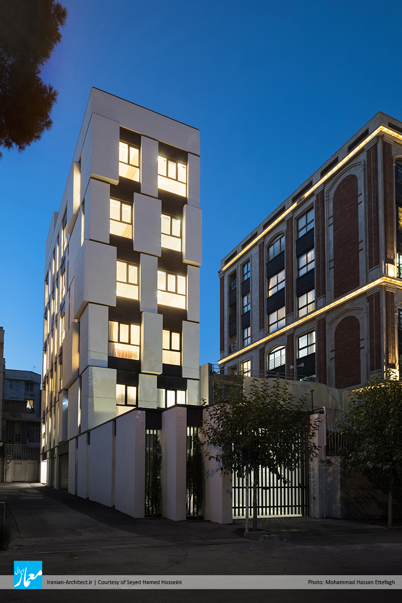
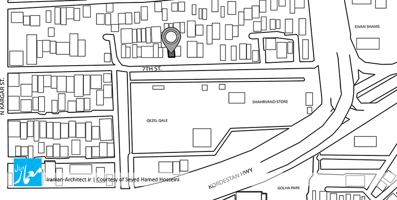
پروژه مسکونی پاییز ۵ در پنج طبقه تکواحدی، در محله امیرآباد تهران، در زمینی به مساحت ۱۶۶ مترمربع ساخته شده است که فقط از جبهههای جنوبی و غربی، امکان بازشو و ورودی دارد. عدم توجه به طراحی مناسب برای بناها و معابر، و همچنین بافت نسبتا فرسوده این محله، آنجا را به مکانی خنثی تبدیل کرده است که مانع جذب افراد به زندگی در این محل میشود.

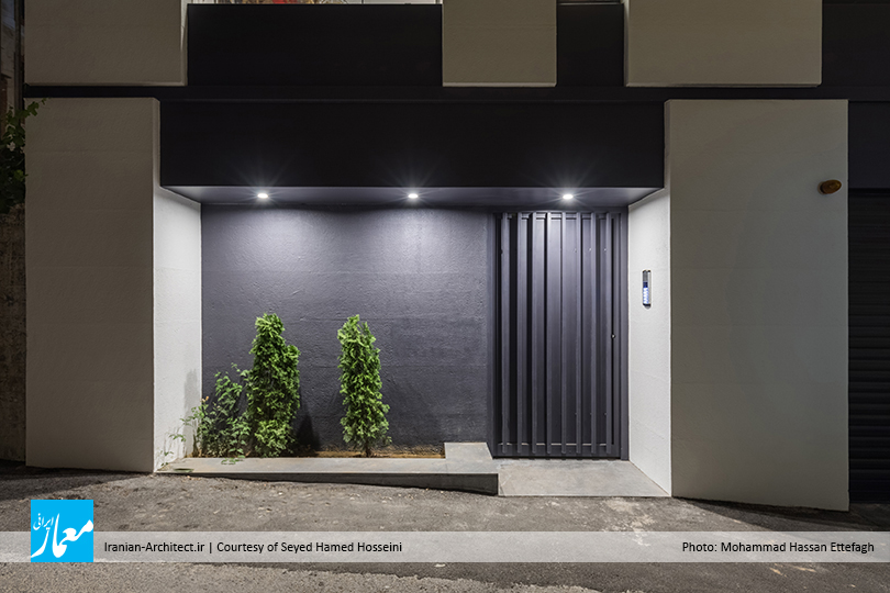
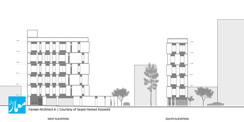
هر پروژه معماری با چالشهایی روبهروست که مواجهه با آنها و رسیدن به پاسخ مطلوب، سناریوی مخصوص آن بنا را میسازد. در این پروژه نیز عرض کم زمین، ما را در طراحی داخلی (پلان) و خارجی (نما) با محدودیتهایی روبهرو کرد، هرچند دونبش بودن آن، امکان نورگیری بهتری را برای ساختمان فراهم میکند. از طرفی دیگر، نقش اصلی و تاثیرگذار در جذب نگاه رهگذران را، نمایی از بنا که رو به معبر اصلی است، ایفا میکند، حال آنکه در زمین دونبش این پروژه، نمای اصلی بنا که رو به معبر اصلی است، دارای عرض کوچکتری است و مساحت کمی را در نمای خیابان به خود اختصاص داده است.

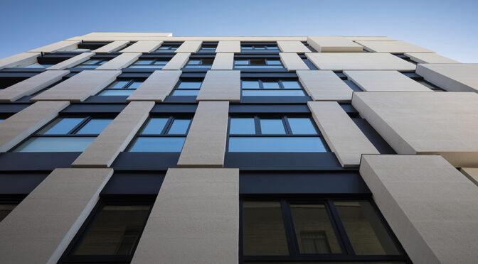
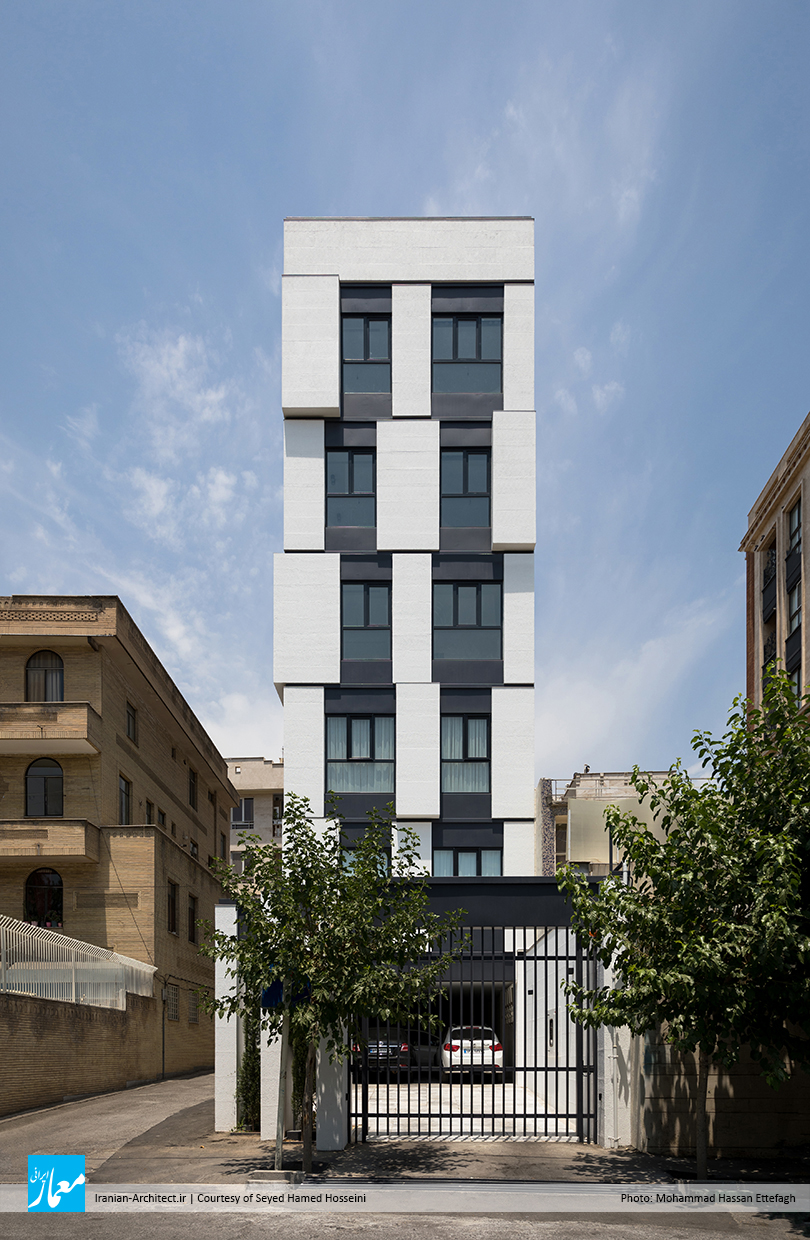
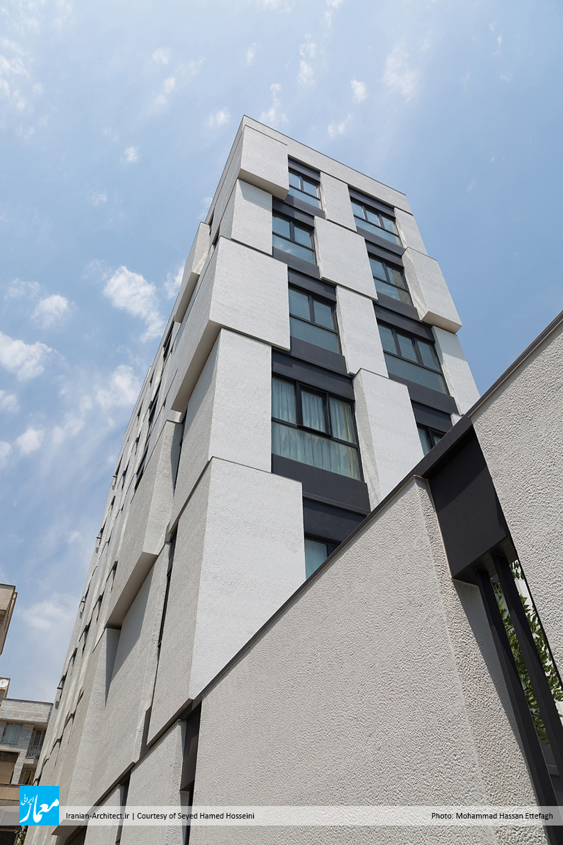
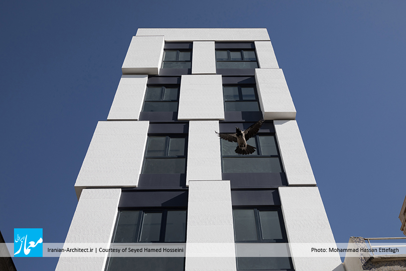
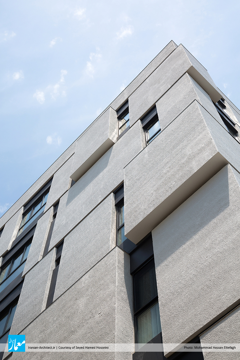
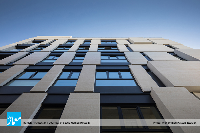
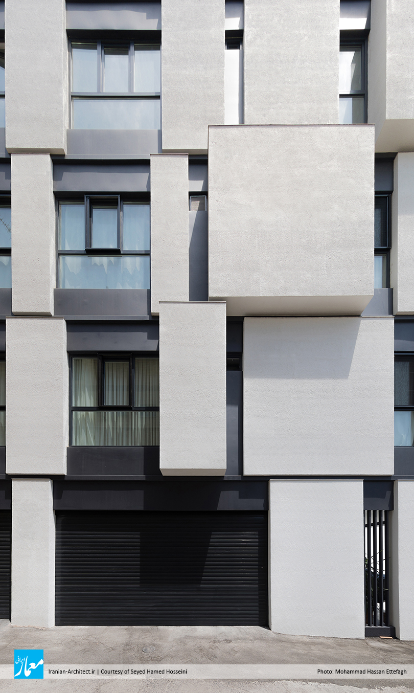
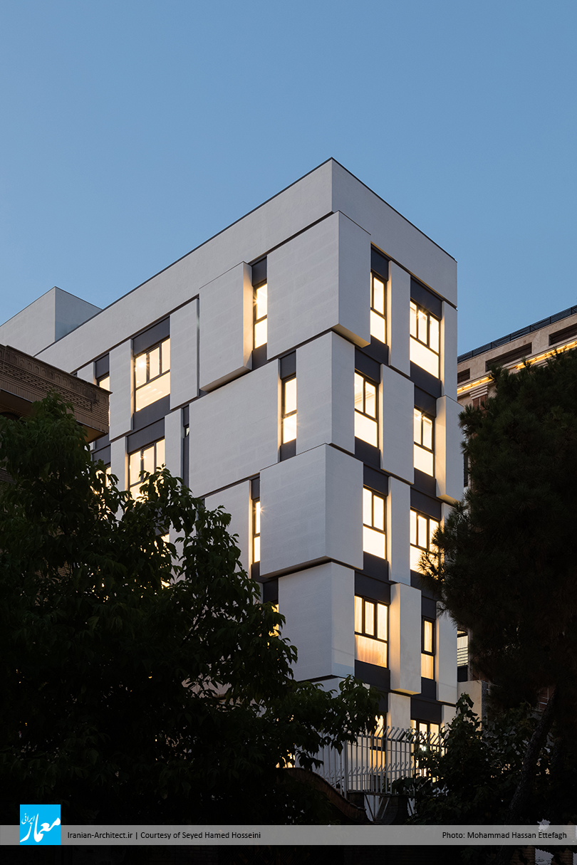
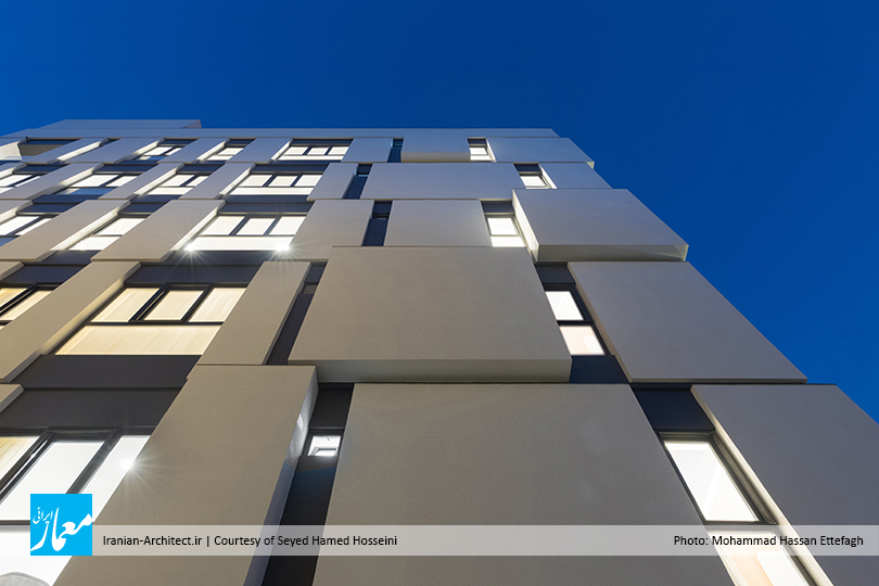
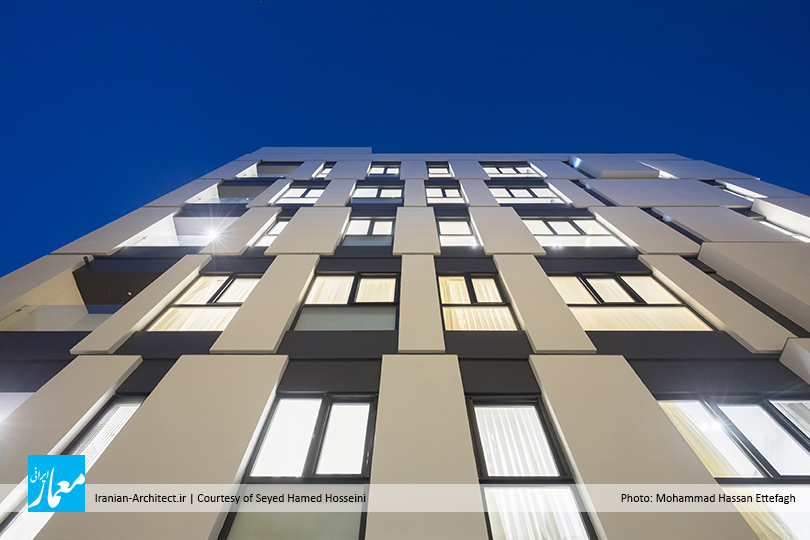
طراحی پروژه به گونهای پیش رفته است که با شکستن عناصر اصلی نما به قطعات مجزای کوچکتر و دارای ابعادی متفاوت، ضمن ایجاد نوعی خطای دید، از وزن بصری عرض کم نمای اصلی کاسته شود، و از طرفی، این شکست و تقسیمات نما بتواند بر اساس پاسخ به نیازهای کاربردی پلان شکل بگیرد. در نهایت، نما تبدیل شده است به نمایش واضحی از هندسه قوی مکعبهایی که به عنوان ساختار و عناصر اولیه طراحی به کار برده شدهاند، و رنگ سفید و روشن مکعبهای نما در زمینه تیره، نما را منبسط و بزرگتر به نظر میرساند. تراکم و یا عدم تراکم این فرمهای مکعبی نسبت به یکدیگر، نوعی ریتم را در نما به وجود میآورد که طول زیاد جبهه غربی، اجازه بازی فرمی و درک این ریتم را فراهم میکند. همچنین ضخامت متفاوت این مکعبها و عقبرفتگی بازشوها نسبت به سطح نما، شکست نور و ایجاد سایهروشن در نما را به همراه دارد، و با تشدید اختلاف بعد و بازی فرمی، میتواند وزن بصری خاصی را به این نمای مسطح و خنثی ببخشد.

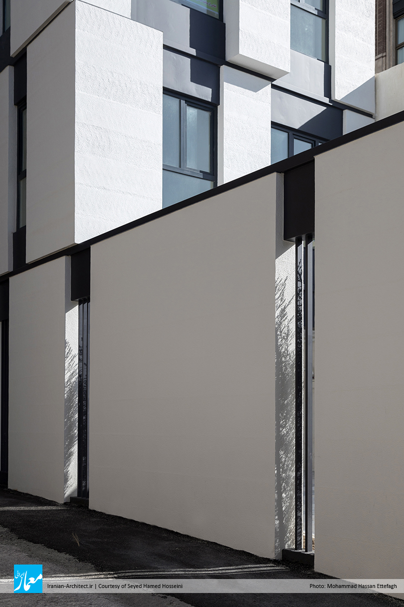
از دیگر راهکارهای طراحی، امتداد فرم نمای ضلع کوچکتر (نمای اصلی) به سمت نمای ضلع بزرگتر (نمای فرعی) بناست که این تکرار و پیوستگی فرمی، نوعی ابهام را در شروع و پایان نمای اصلی و فرعی ایجاد میکند و میتواند نمای ضلعی از بنا را که رو به معبر اصلی است، شاخصتر و بزرگتر به نظر برساند. همچنین به دلیل دونبش بودن زمین، ایجاد پخ در نبش ساختمان الزامی است که به منظور تناسب فرمی با کل بنا، پخ دیوار با شکستگیهایی حل شده که آن را از نمونههای متداول و مشابه خود متمایز کرده است.

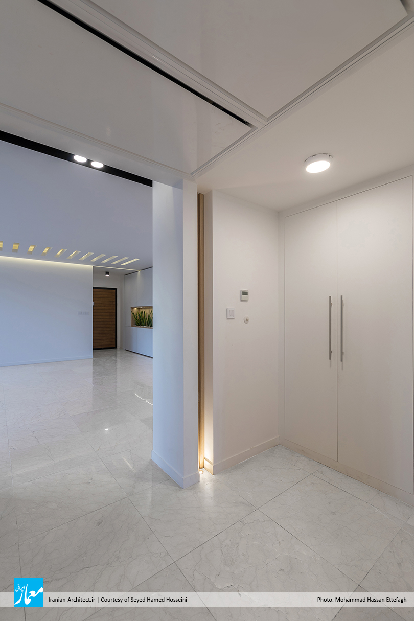
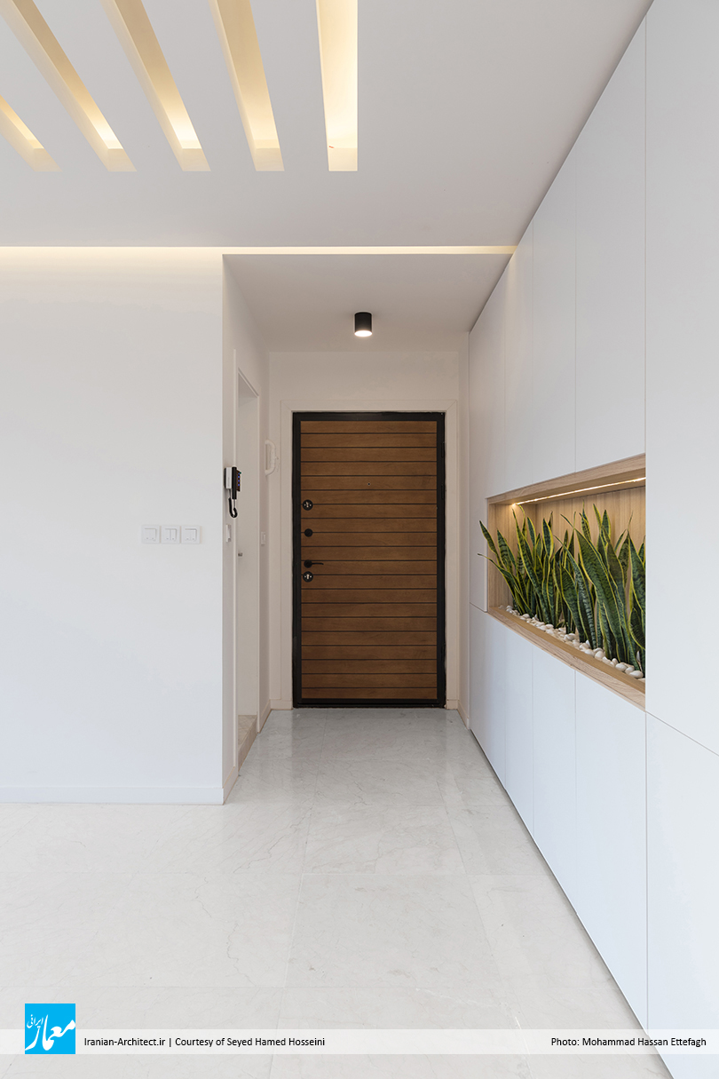
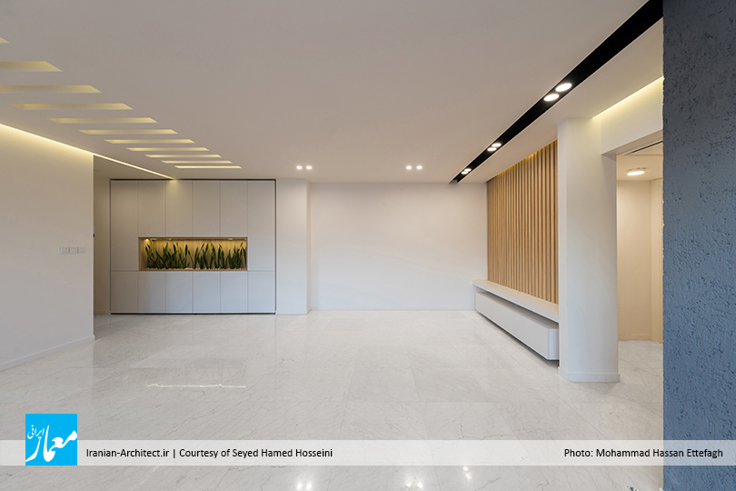
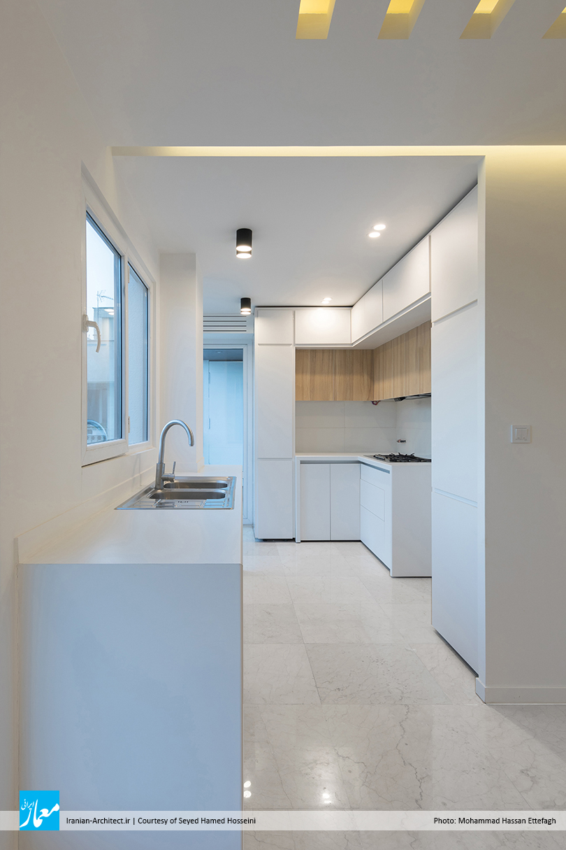
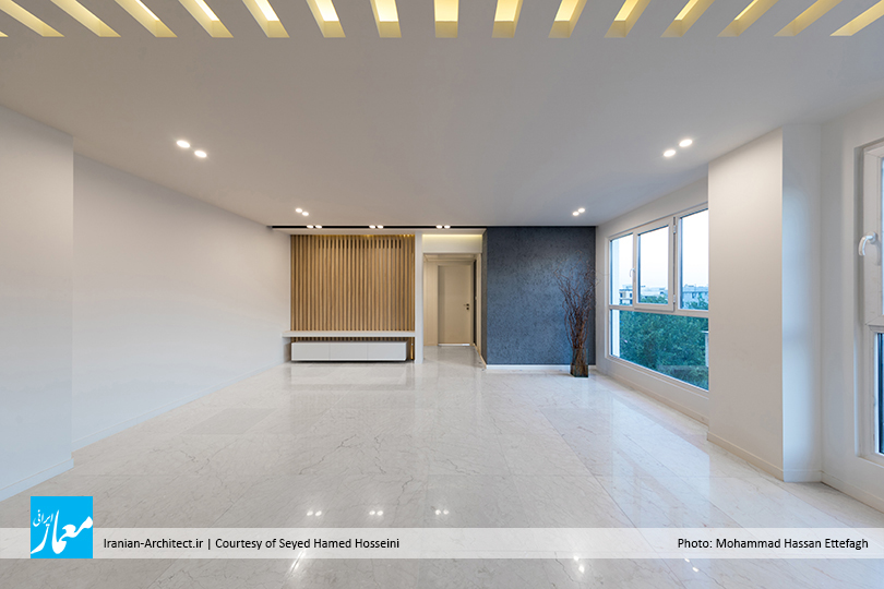
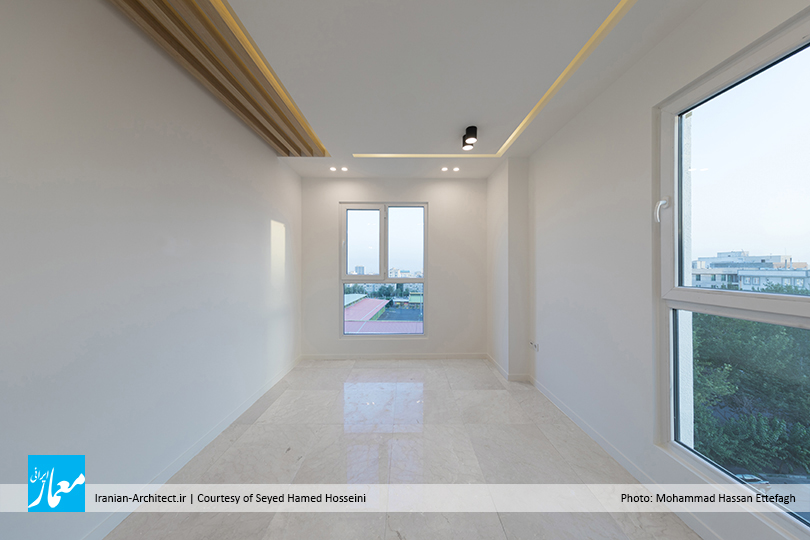
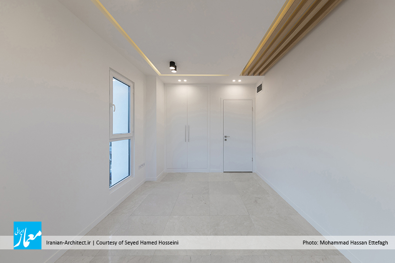
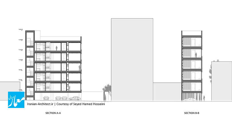
پلان پروژه طوری طراحی شده است که تمام فضاهای اصلی و فرعی از نور طبیعی برخوردارند، و تنوع ابعاد پنجرهها در نما، نشانی از تناسب عملکرد هر فضا با میزان ورود نور طبیعی به دل آن است. سنگینی بصری نما (فرمی صلب با حداقل بازشو) از سمت قرارگیری فضای اتاقهای خواب که فضایی خصوصی است، شروع میشود و هرچه به سمت فضای عمومیتر خانه (پذیرایی و آشپزخانه) پیش میرویم، از سنگینی بصری نما کاسته میشود، و با افزایش فضای بینابینی (بازشوها)، به سبکی فرمی و آزادی فضای عمومی خانه، نزدیک، و در نهایت، به فضای باز تراس (گشودگی فرمی) ختم میشود. همچنین جدارهای از اتاق خواب که رو به ضلع غربی است، با حداقل بازشو، علاوه بر حفظ خصوصی و دنج بودن فضا، از آن در برابر نور غرب محافظت میکند.

متریال اصلی مکعبهای بهکاررفته در نما، سنگ سفیدرنگ است، و فضای خنثی و سطوح تیره بین آنها پروفیل هستند که به منظور مقاومت در برابر شرایط جوی، از رنگ ماشین برای این پروفیلها استفاده شده است. نما با متریال سفیدرنگ و روشن خود، سبکی و آزادی به بنا میبخشد، و چنین مشخصه ساده و غیرمبهمی، ادراک را برای ذهن انسان آسان میکند که خوانایی فضای زیست را به همراه خواهد داشت، و سلسلهمراتبی از تقسیمات متفاوت فرمی، ناظر را در فهم نما و فضای داخلی آن کمک خواهد کرد.


Paeiz 5 Building
Seyed Hamed Hosseini
Semi-Finalist of Iranian Architect Merit Award 2021
Location: Tehran, Iran
Date: 2019
Area: 670 sqm
Status: Completed
Client: Yousef Farahani
Design Associate: Shadi Shademanrooz
Structure Design: Ashkan Feizi Raad
Construction: Farasazan Group
Construction Site Supervisor: Ali Farahani, Salar Negahban
Graphic & Presentation: Melika Asgari Sereshg, Fatemeh Sadat Abiri, Negar Sanian
Photo: Mohammad Hassan Ettefagh
The project is located in Amirabad neighborhood of Tehran, and the entrance is from the southern and western sides. This building has been developed in five floors. In this neighborhood, due to being worn-out and the lack of attention to proper design for buildings and passages, it has become an unpleasant place that prevents people from living in it.
Every architecture project faces challenges that achieving the answer, will create a specific scenario for that building. One of the features of this project’s site is its small width, which made limitations in interior (plan) and exterior (facade) design. Meanwhile, its two corners allow better lighting for the building.
The facade of the building that is facing the main passage, plays the main role to catch the eyes of passers-by; This side has a smaller width. Therefore, we designed the facade by breaking its main elements into smaller separated parts with different dimensions, which reduces the visual impact of the main façade‘s narrow width. The facade became a clear representation of the strong geometry of the cubes that were used as the basic design elements. The white cubes in the dark background, expanded and enlarged the facade. Also, the different thickness of these cubes and retractions of boxes, intensifies this difference, which can give a better vision to the flat surface, and it will cause light refraction and shadow.
Another design solution is the form extension from the smaller side to the larger one. It results in a confusion about the main facade’s borders, and made it seems larger and more prominent. Due to the fact that there are two sides for this building, it was necessary to create a chamfer in the corner of the building, according to the regulations, and in order to fit the other forms, the wall chamfer is solved with fractures that distinguish it from its common counterparts.
The project plan is designed in such a way that all the spaces have natural light, and the variety of dimensions of the windows in the facade, shows the function of each space, and the amount of natural light entering it. Rigid forms with minimal openings will start from the location of the bedrooms (private spaces), and as it moves towards the more general areas of the house (living room and kitchen), the rigid parts will decrease, and finally, there is the open space (balcony). Also, the bedroom wall facing the west side, with minimal opening, protects against western light, in addition to being private and cozy.
The cube ‘s material is white stone, and the dark surfaces between them are profiles. For these profiles, the car color is used, due to its resistance to weather conditions. Such simple and unambiguous characteristics give perception to the mind, and will make the living space readable, and the divisions of facade will help the observer to understand the interior spaces.