
گالری مبل فدک
معمار: آتلیه آرتیک
موقعیت: تبریز، ایران
تاریخ: 1392
مساحت: 1858 مترمربع
وضعیت: ساختهشده
کارفرما: علیرضا نصرتی
تیم طراحی: رامین طائری اصل، فریدون آزادمنش، سالار زینتالدینی
عکس: فریدون آزادمنش


پروژه حاضر، زمانی برای تیم آرتیک طرح شد که تخریب عناصر معماری بنای قدیمی انجام گرفته بود و فرصت بسیار محدودی برای طراحی در اختیار داشتیم و از طرفی، کارفرما به دنبال طرحی گیرا برای جذب بیشتر مشتری بود. لذا با توجه به زمان محدود و حجم کاری بالا، تصمیم بر این شد تا پروژه مرحلهبندی شود و طراحی مطابق اولویتهای کارفرما و اجرا، در بازههای زمانی مجزا و در عین حال پیوسته انجام گیرد.

بنای پیشین پروژه، ساختمانی با اسکلت فلزی و با ابعاد 21 متر در طول و 28 متر در عرض (بر خیابان) بود و به دلیل جداشدن دو شریک، ملک آنها نیز در حال تفکیک بود و بعد از تفکیک، طول نمای مبل فدک از 28 متر به 16 متر کاهش مییافت. پوشش اولیه ساختمان نیز، آجری بود که بعدها با نمای تخت کامپوزیت پوشانده شده و داخل فضاها نیز به گچ بریها و رنگبندیهای معمول دهه شصت مزین بود. همچنین، قبل از حضور تیم معماری، در پشت بنای فلزی حاضر، یک ساختمان بتنی در حال ساخت بود و کارفرما قصد ادغام این دو بنا را داشت. نکته بارزی که در طراحی ما تأثیر کلانی گذاشت، این بود که بنای پیشین با عنوان مبل فدک فعالیت میکرد و قرار بود بنای تفکیکشده نیز با همین عنوان به فعالیت خود ادامه دهد. لذا تیم طراحی بر این شد تا ماهیت عنوان پیشین را حفظ و با وجود کوچکترشدن بنای فعلی، اصالت اولیه آن را حفظ کند.

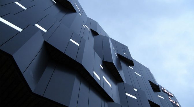
در ابتدا، با بررسی محیطی بنا و با توجه به قرارگیری در کنار رودخانه و جاده، نکات حساس سایت را شناسایی کردیم. حضور جاده و ترافیک بالای خودرو در آن باعث شد در طراحی نما، علاوه بر نمای نزدیک و پیاده، به نمای دور بنا نیز بپردازیم. از نظر ما، نمای دور پروژه باید به افراد عبوری از جاده توجه میکرد و میبایست مانند آنان که در حرکت هستند، پویا میبود. ایده اولیه بدینصورت شکل گرفت که با حفظ تقریبی مساحت نمای قبل از تفکیک، برای افراد عبوری از جاده نیز نمایی مجزا از نماهای معمول ایجاد کنیم، نمای قبل از تفکیک را به سمت نمای بعد از تفکیک فشردیم و با تاخوردگیهای به وجود آمده، نمایی رو به جاده به دست آمد؛ تصویری در ابعاد شهری که در حال عبور از جاده تغییر میکرد و هر لحظه از حرکت را در نظر افراد عبوری، از نو میساخت.

ایده برای نمای دور مناسب بود، اما برای نمای نزدیک و افراد پیاده، بیانی دیگر میخواستیم، لذا برای پختهترکردن نمای دور و ایجاد تصویری نو برای افراد پیاده، در کنار آمادگی برای رسیدن به فضای داخل و ایجاد سایهروشن، نمای دور را به چند ردیف تقسیم کردیم و تاخوردگیها را اتفاقیتر جلوه دادیم. در سطح تراز همکف نیز، با استفاده از مصالح صمیمیتر و جزئیات ریزتر در دیوار و کفسازی پیادهگذر، سعی در القای حس آسودگی را داشتیم. ورودی نیز به تبع همین حس، از سفت و سختی خود خارج شد و در کنار دعوت به داخل، دارای حرکتی در محور بنا به خارج است و از درون بنا، آخرین بیان را نیز در بر دارد. ترکیب نمای به دست آمده در روز کامل مینمود، امّا در نمای شب نیز لازم دیدیم برای القای حس حجمی که در روز بود، از منبع نوری در بدنه نما استفاده شود.

پس از طراحی نما و ورود به طراحی داخلی، اولین چالش ما، ایجاد خوانشی از بیرون در داخل بود، به طوری که تاکید بر حضور شماتیک فرمهای شکلگرفته نما در داخل باشد و کیفیت نمایش را که محور اصلی طراحی بود، افزایش دهد. در همین راستا، به وسیله ریتم و تکرار فرمها، به ماهیت فضا و چیدمان داخل آن تاکید کردیم، به طوری که کاربران فضا در زمان کوتاهی که از آن استفاده میکنند، بر فضا تسلط داشته و احساس امنیت کنند. در اجزای داخلی، المانهایی برای حرکت و سکون بصری قرار داده شده تا تعامل با فضا را طبقهبندی کنند. حرکت سیال و هدایت بصری نورها در سقف و دیوارها و همچنین تقسیم بصری ستونها در قسمت بالکن، با ایجاد پیوستگی و سلسله مراتب، به کاربران اجازه تعامل بهتر با فضا را میدهند.

یکی از نکات مهم طراحی، توجه به مناظر اطراف است و با در نظرگرفتن دره سرسبزی که در جنوب بنا واقع بود، دید وسیع و بازی را در انتهای فضای داخلی به این فضا اختصاص دادیم و از طرفی، گشودگیهای ضلع شمالی (سمت جاده) را مسدود کردیم تا از تشویش و منظر نامتناسب آن در امان باشیم.


Fadak Furniture Gallery
Architect: Artic Studio
Location: Tabriz, Iran
Date: 2013
Area: 1,858 sqm
Status: Completed
Client: Alireza Nosrati
Design Team: Ramin Taeri Asl, Fereidoon Azadmanesh, Salar Zinatoddini
Photo: Fereidoon Azadmanesh
This project has been set forth for Artic Studio when destruction of architectural elements of old building had already been taken place and there was limited time for designing. Furthermore, the employer desired an attractive design for drawing more attention of the clients. Considering the limited time and high demand of activity, it was decided to carry out the project in several phases and the design to be done according to employer’s priority and its operation to be taken place in distinct, yet continuous time ranges.
The previous construction was made of metal structure with 21 meters in length and 28 meters in width (along street), due to separation of two partners of the gallery, their estate was being dissociated, and after dissociation, length of façade of Fadak gallery reduced from 28 meters to 16 meters. The primary façade of building was made of bricks witch was later on covered with composite. The inside of the building was ornamented with plaster molding and color-scheme that was common in 1980’s. Furthermore, before attendance of architectural team, behind this metal structure, a reinforced concrete building was under construction, and the employer intended to merge these two buildings. The significant point which had considerable impact on our design was that the previous building was working as Fadak furniture gallery and the dissociated building was to continue its activity with the same title. Therefore, the design team decided to maintain the previous title, and though the area of the building had been reduced, its primary originality is maintained.
At the beginning, we studied the building environment, and as it is located along the river and the road, we identified key points of the site. Existence of the road and high traffic made us to consider not only close and on foot façade, but also the far view and perspective. In our opinion, far view of the project is needed to address people who pass the road and should be of high dynamism just as people traveling on the road. The first idea was preserving the approximate area of previous façade before dissociation, and to establish a separated façade distinct from ordinary façades for people who were passing on the road, we squeezed the façade before dissociation toward that of after dissociation, and by establishing foldings a façade toward the road is developed. It is consisted of an image in city dimensions which changes by moving on the road and renewed every moment to passing pedestrians.
The idea was appropriate for far view, yet we required another expression for close view and passer-byes. To make the far view more effective and establish a new image for pedestrians in addition to preparing them to enter the internal space and develop shadow, the far view has been divided into several rows. For this purpose, we manifest the foldings more random and casual. We attempted to induce sense of convenience and relief by incorporating more sincere materials and finer details in ground floor wall and pavement. Similarly, the entrance relinquished its hard sense and while inviting people inside, it is featured by a movement outward along building axis and it encompasses the last expression even from the inside of building. Obtained façade composition seemed to be complete at day, yet in night view, it was needed to use lighting source in the body of façade to induce the same sense of daytime.
When the façade was completed, our first challenge was establishing a proportion between internal and external part of the building in design, so that, it highlights the schematic presence of shaped forms of the internal façade within inside. In this case, it would increase the quality of exhibition as the major theme of design. For achieving it we, emphasized on a quality of the space and arrangement of the furniture inside the building, by rhythm and repetition of the forms. In this way, the users of space would be able to dominate the space and have sense of security within short time. Within interior components, some elements are placed for bringing about visual movement and expose to classify the interaction with space. Fluid movement and visual guidance of lighting in ceiling and walls as well as visual division of columns in balcony, allow users to better interact with space, by developing continuity and hierarchy.
One of the important points of design is paying attention to surrounding landscape. Considering the lush valley at the south of building, we assigned a large and open view at the end of internal space, furthermore, openings of northern edge (along road) were blocked to obstruct the perturbation and undesirable view of road.