
ساختمان تجاری و مسکونی مرز
دفتر معماری هرم (مرتضی علینیا مقدم، حمید بابایی، هیوا ابنعباس)
موقعیت: بانه، کردستان، ایران
تاریخ: ۱۳۹۸
مساحت: ۱۶۰۸ مترمربع
وضعیت: ساختهشده
کارفرما: ایوب فتاحی
همکاران طراحی: بهاره شیسی، مرضیه گلشاهی، فاطمه اسدسلیمانی، اندیشه اسکویی، احسان کازرونی، سحر بیگدلی
اجرا و نظارت: هیوا ابنعباس، ناصر شبانی
عکس: علی اسدی
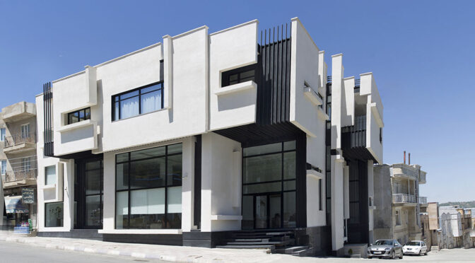
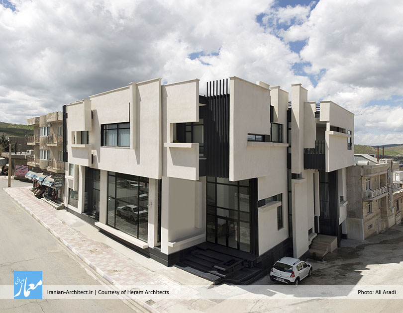
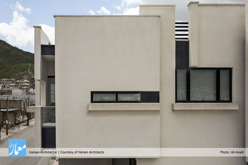
ساختمان تجاری و مسکونی مرز در شهر مرزی بانه، در استان کردستان واقع شده است. زمین ۵۰۰ مترمربعی این پروژه از تجمیع سه بلوک کنار هم شکل گرفته و در یکی از بلوارهای اصلی بانه و در نبش یک کوچه قرار دارد. شهر بانه که در دامنه شمالی رشتهکوههای زاگرس واقع شده، دارای اقلیمی کوهستانی است و بافت آن به صورت متراکم و فشرده است تا از اتلاف حرارتی جلوگیری شود. بیشترین مصالح مصرفی در ساختمانهای این شهر سنگ است و اکثر ساختمانها دارای طیف رنگی کرم ـ خاکی هستند.

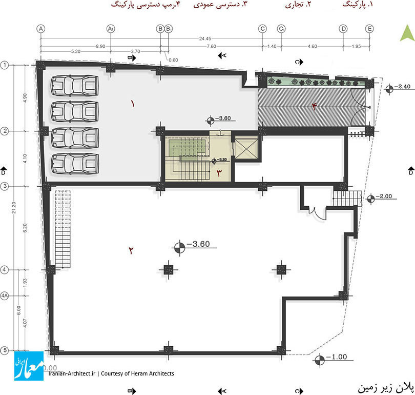
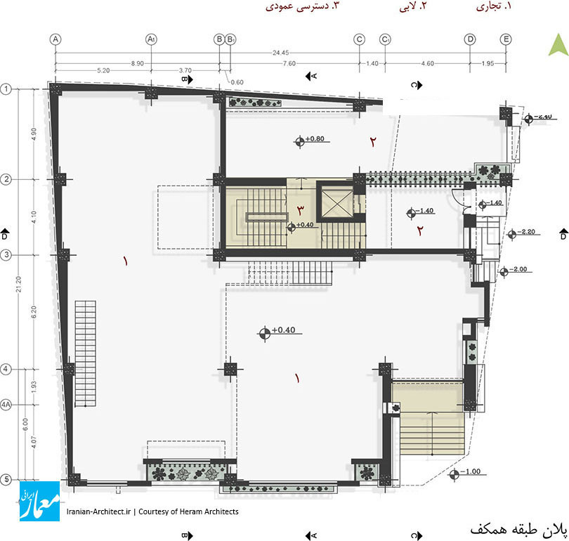
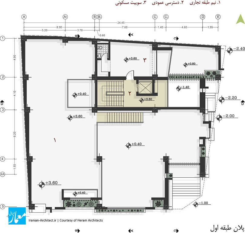
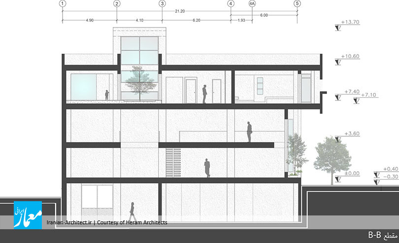
برنامه پروژه به گونهای شکل گرفته بود که یک طبقه در زیرزمین (پارکینگ و تجاری)، طبقه همکف و یک نیمطبقه (تجاری)، و یک طبقه روی آن را که یک واحد مسکونی به صورت تخت بود، شامل میشد. کارفرما خواستار ارتباط واحد تجاری زیرزمین با واحد تجاری طبقه همکف، و همچنین ورودی کاملا مجزا برای واحد مسکونی بود و بدینترتیب، برنامه پروژه در یک واحد تجاری و یک واحد مسکونی خلاصه میشد. از اینرو، قرارگیری این دو عملکرد در کنار هم که از نظر ماهیت و نیازها کاملا با یکدیگر متفاوت هستند، و هماهنگی آنها در یک پروژه، مهمترین چالش طراحی بود.

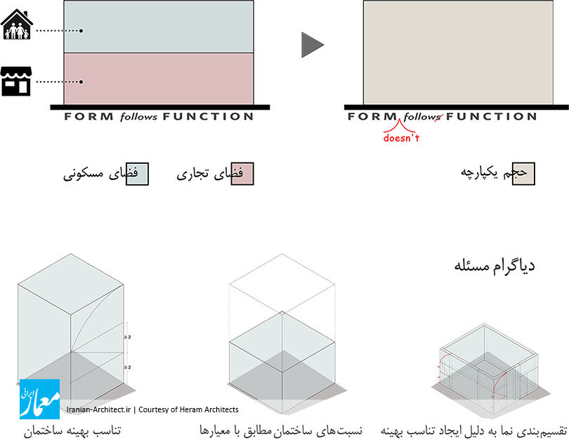
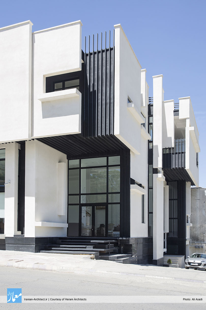
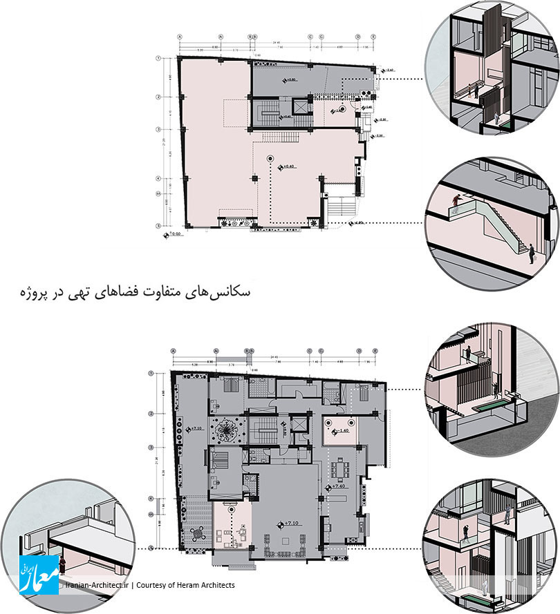
با توجه برنامه پروژه (یک واحد تجاری و یک واحد مسکونی) و مقیاس پروژه نسبت به بافت ریزدانه شهری، مهمترین مسئله پروژه، قرارگیری و همپوشانی این دو عملکرد در کنار یکدیگر بود. سوال مطرحشده بدینگونه بود که پروژه باید بتواند خود را به صورت یک حجم یکپارچه در بافت شهری نمایان کند و همچنین واکنشی باشد به شعار اصلی معماری مدرن، یعنی «فرم از عملکرد پیروی میکند». بدینترتیب، به دلیل وجود دو عملکرد مختلف در پروژه و تاثیرات آنها بر جدار بیرونی، و یکسانبودن ارزش بصری آنها در حجم (از لحاظ تناسبات طولی و ارتفاعی)، حجمی یکپارچه و هماهنگ که در کلیت به صورت یک فرم پیوسته دیده میشود، مورد بررسی قرار گرفت و برای پیشبرد این ایده، با توجه به تناسبات طولی، عرضی و ارتفاع ساختمان، و به منظور هماهنگی حجم با بافت ریزدانه شهری، از استراتژی خردکردن حجم استفاده شد.

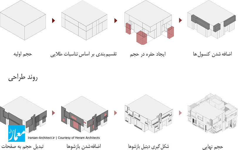
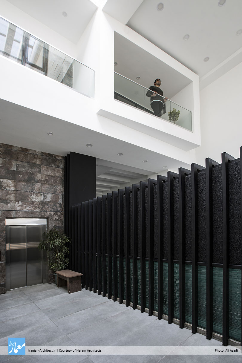
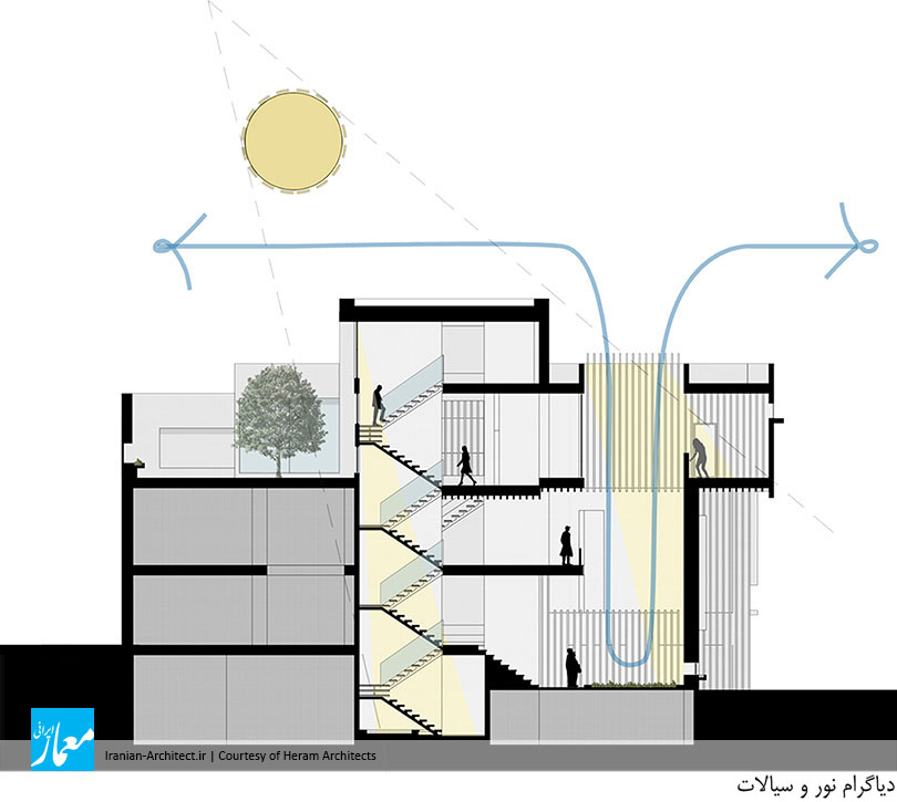
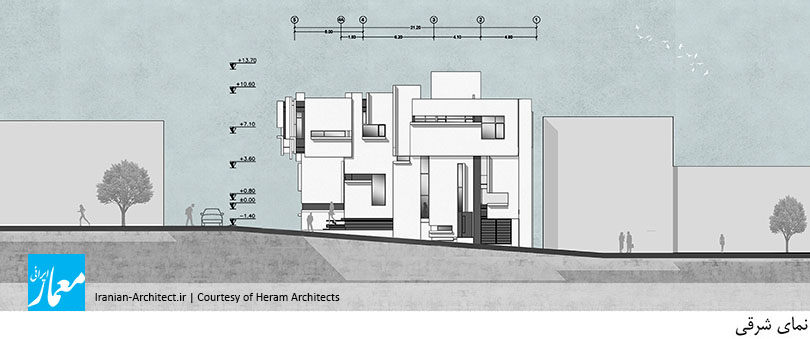
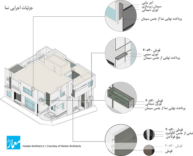
با توجه به فضاهای درون پروژه و نیاز فضاها به نور، صفحاتی در نظر گرفته شد که با در کنار هم قرارگرفتن این صفحات، حجم اصلی شکل میگیرد. تقسیمبندی این صفحات و تناسبات آنها بر اساس تناسبات طلایی صورت گرفت تا بتواند بیشترین بازدهی بصری را داشته باشد. برای فضای تجاری، صفحاتی با مقیاس بزرگتر و بازشوهایی وسیعتر، و برای فضاهای مسکونی نیز بازشوهایی متناسب با فضاها و عملکرد داخلی آن شکل گرفت. بدینترتیب، پروژه به صفحاتی تبدیل شد که از کنار هم قرارگیری آنها به یک حجم واحد میرسیم، حجمی که علاوه بر هماهنگی با بافت پیرامون خود، دارای چالشی در درون برای تبعیت فرم از عملکرد بود. پس از شکلگیری این صفحات که پروژه را به چند حجم کوچکتر تقسیم کرده بودند، با عقب و جلو کردن آنها نسبت به یکدیگر، پروژه دارای عمق و نمای دوبعدی دارای سه بعد شد. بازشوهایی نیز که در هر یک از این صفحات قرار دارد، با دیتیلی که نشاندهنده بریدگی صفحات است، شکل گرفتند. در نهایت، پس از شکلگیری حجم کلی، صفحات و بازشوها، از عنصر رنگ برای نمایانکردن پروژه در بافت شهری استفاده شد، بدینگونه که تمامی صفحات شکلدهنده حجم از جنس سیمان سفید شکل گرفت و در فاصله بین صفحات از رنگ مشکی استفاده شد تا اینکه پروژه خود را به رنگ سیاه و سفید در بافت شهری نمایان کرد.

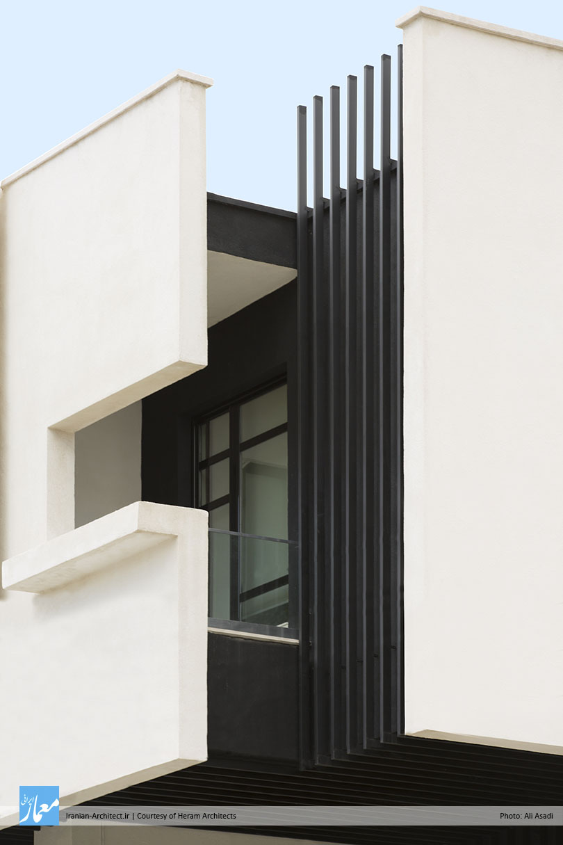
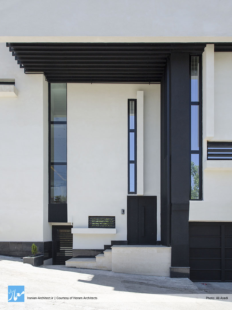
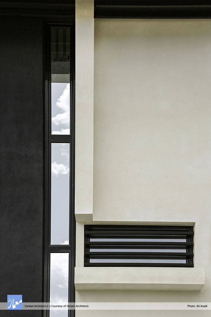
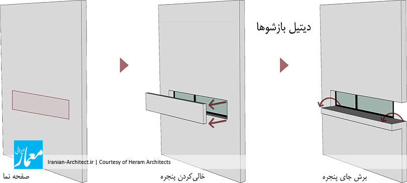
طراحی بازشوهای پروژه با توجه به نیاز فضاهای داخلی به نور شکل گرفت، بدینگونه که هر فضا با توجه به تناسب و اندازه خود، مقدار نور مورد نیاز را داشته باشد. پس از شکلگیری اندازه بازشوها، دیتیلی خاص نیز برای هماهنگی بیشتر با پروژه طراحی شد، بدینترتیب که هر بازشو قسمتی از صفحهای را که بر روی آن قرار گرفته است، بریده و قسمت بریدهشده را با چرخشی ۹۰ درجهای، تبدیل به سکویی برای قرارگیری گل و گیاه میکند. در واقع، هر بازشو با بریدن صفحه، علاوه بر تامین نیاز نوری و تهویه فضای داخلی، سبزینگی را نیز به همراه دارد.

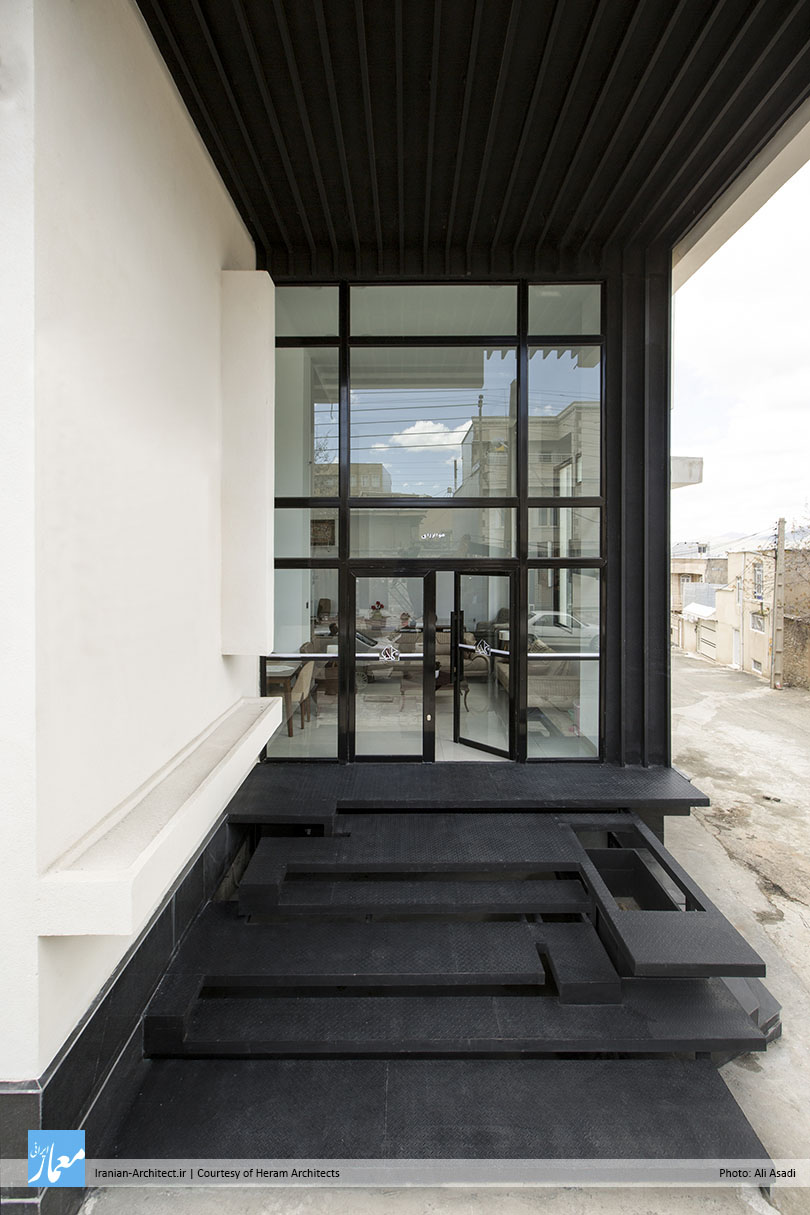
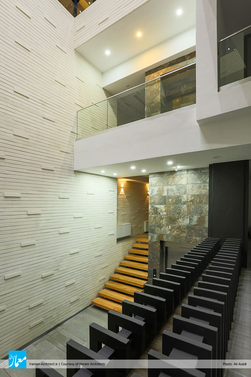
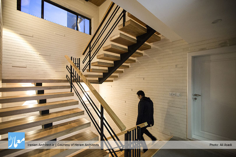
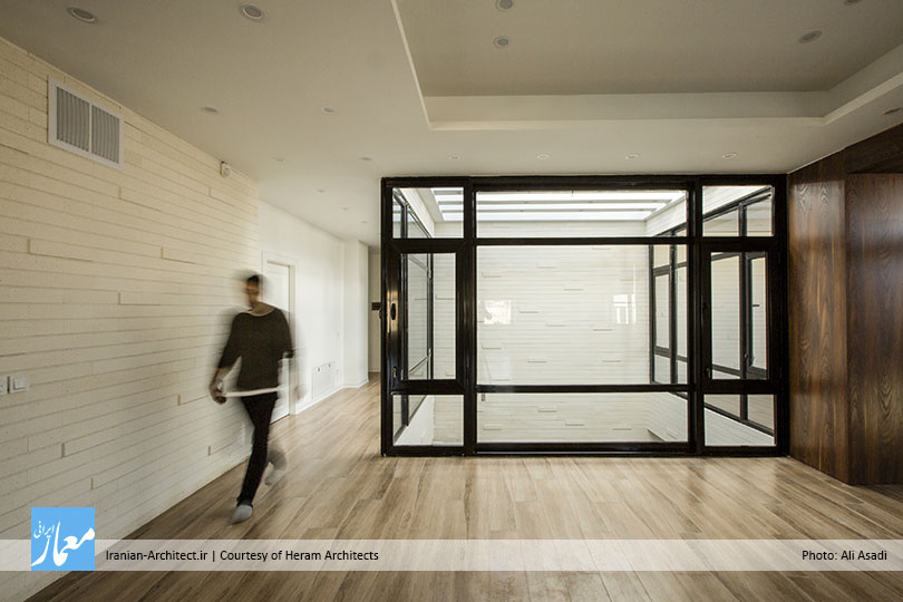
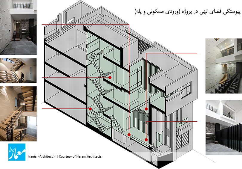
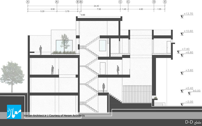
مسئله دیگری که در طراحی فضای مسکونی مورد توجه قرار گرفت، ایجاد لایهای مابین فضای درون و بیرون بود که کیفیت فضایی هر دو را داشته باشد. این فضا در قسمت پلههای ورودی واحد مسکونی شکل گرفت و باعث شد پلههای دسترسی که معمولا در ساختمانهای مسکونی به صورت فضای مرده قرار میگیرد، به فضایی پویا و قابل استفاده تغییر ماهیت دهد. این لایه مابین هم درون است، هم بیرون، هم این است و هم آن؛ این فضا علاوه بر حفظ برخی کیفیتهای فضای بیرونی (دید به آسمان و فضای تهی پیوسته)، ویژگی فضاهای داخلی نظیر محرمیت را هم دارد. در واقع، تلاش شد با ایجاد این فضا، پله سازماندهی شود و در کنار آن، ماهیتی تازه به خود بگیرد تا کاربر بتواند در حیاطی خصوصی که با محیط بیرونی نیز در ارتباط است، از کیفیت مناسب فضا لذت ببرد. همچنین با تغییر ماهیت پله، ما فضای عملکردی را به فضای تعامل تبدیل کردیم تا ضمن ایجاد راه ارتباطی بین فضاها و نور مناسب، محیطی برای مکث و گفتگو ایجاد شود که از طبقات مختلف دید داشته باشد.

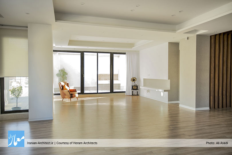
در شکلگیری پلان واحد مسکونی، خواسته کارفرما فضایی کاملا تخت در یک طبقه بود. برای طراحی این واحد، عرصههای عمومی و خصوصی از یکدیگر جدا شدند و حیاطی خصوصی به مساحت ۱۰۰ مترمربع در کنار آن در نظر گرفته شد. این حیاط فضای نیمهباز اصلی در پروژه را شکل میدهد و محرمیت خود را نسبت به فضای بیرونی حفظ میکند. دسترسی به حیاط هم از عرصه عمومی (پذیرایی) و هم از عرصه خصوصی (اتاق خواب) امکانپذیر است و از سوی دیگر، نورگیری اصلی فضاهای داخلی از آن تامین میشود. همچنین با توجه به فشردگی بافت شهری و تراکم بناها به داخل در اقلیم بانه، این ویژگی در شکلگیری پلان واحد مسکونی و بازشوهای آن مورد توجه قرار گرفت تا پروژه خود را به داخل جمع کند و بیشتر بازشوها رو به فضای داخلی (حیاط خصوصی) باشند.

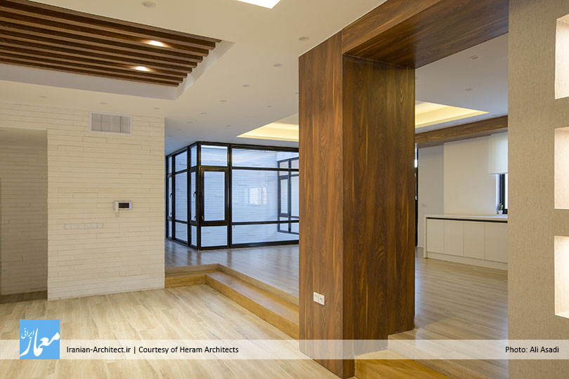
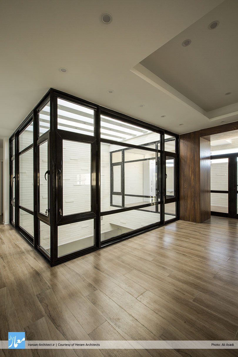
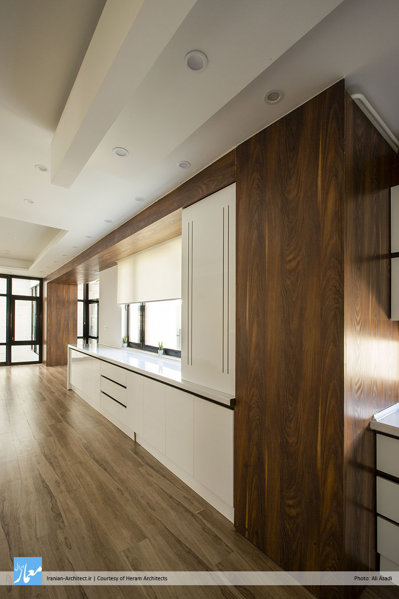
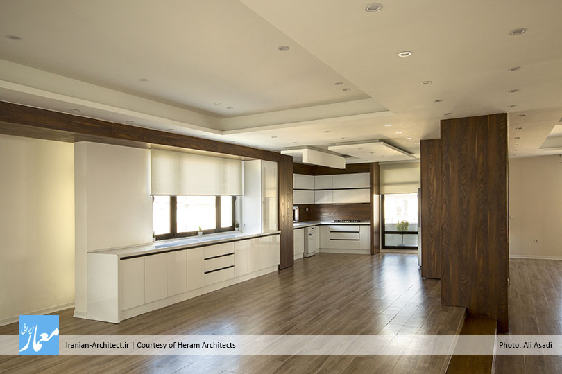
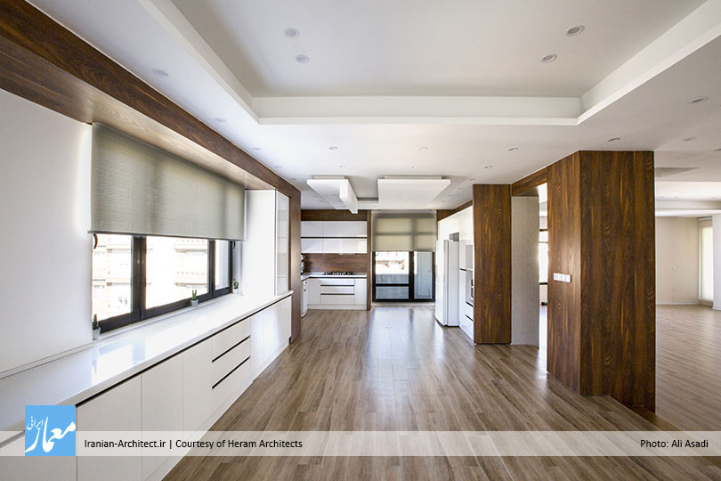
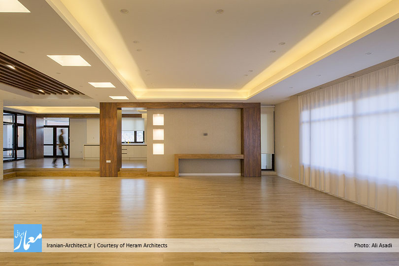
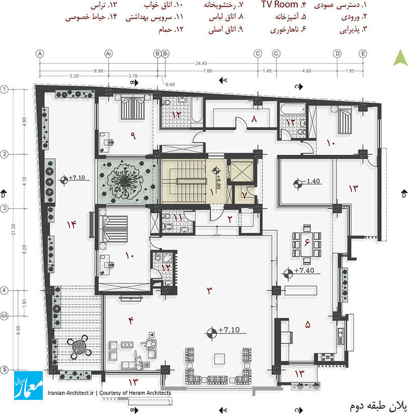
در تقسیمبندی داخلی واحد مسکونی، پس از عبور از ورودی و فضای تقسیم، وارد فضای پذیرایی با مساحتی حدود ۱۰۰ مترمربع میشویم که در کنار این فضا، اتاق خواب میهمان و TV Room قرار دارد. برای جداسازی بصری قسمت آشپزخانه و ناهارخوری نیز که فضاهای خدماتی واحد هستند، از دو پله که اختلاف سطحی ۳۰ سانتیمتری را به وجود میآورند، استفاده شد. فضای ناهارخوری از نورگیری که در قسمت مرکزی پلان تعبیه شده است، به آسمان دید دارد. در عرصه خصوصی نیز با توجه به خواسته کارفرما، دو اتاق خواب با سرویس کامل و نیز یک اتاق لباس تعبیه شد که هرکدام از اتاقهای خواب تراسهای مجزای خود را دارا هستند.


Marz Commercial & Residential Building
Heram Architects (Morteza Alinia Moghadam, Hamid Babaei, Hiwa Ebne Abbas)
Location: Baneh, Kurdistan, Iran
Date: 2019
Area: 1,608 sqm
Status: Completed
Client: Ayoub Fattahi
Design Team: Bahareh Sheisi, Marziyeh Golshahi, Fatemeh Asad Soleymani, Andisheh Oskuyi, Ehsan Kazerooni, Sahar Bigdeli
Construction & Supervision: Hiwa Ebneabbas, Naser Shabani
Photo: Ali Asadi
“Marz Commercial and Residential Building” is located in Baneh Frontier City, in Kurdistan province. Baneh is located on the northern slope of the Zagros Mountains and has a mountainous climate. The city fabric is compact to prevent heat loss. Most of the materials used in buildings are stone, and most buildings have a cream-earth color spectrum. The project site is located on one of the main boulevards of the city, at the corner of an alley. The site has an area of 500 square meters consisting of three blocks of adjacent blocks.
The project program was designed to include a basement (parking and commercial), a ground floor and a half-floor (commercial), and one floor on which included a flat residential unit. The client wanted the basement’s commercial to be connected to the ground floor’s commercial as well as a completely separate entrance to the residential unit. Thus, the project program was summarized in one commercial unit and one residential unit. Putting these two functions together that are completely different in nature and needs, and coordinating them in one project, was the most important design challenge.
Given the project program (a commercial unit and a residential unit) and the scale of the project relative to the urban fine-grained fabric, the most important issue of the project was the overlap between these two functions. The question was how the project should be able to present itself as an integrated volume in the urban context, and also be a response to the main slogan of modern architecture (Form follows Function). Thus, due to the existence of two different functions in the project and their effects on the exterior wall, and their visual value in volume (in terms of length and height proportions), an integrated and coordinated volume that is generally seen as a continuous form, is examined. In order to advance this idea and considering the longitudinal, transverse and height proportions of the building and coordinate the volume with the urban fine fabric, a volume crushing strategy was used.
Due to the interiors of the project and the spaces’ need for light, the surfaces were considered to form the volume, side by side. These surfaces and their type of segmentation and their proportions were formed on the basis of golden ratio, to maximize visual output. For commercial space, larger-scale surfaces and larger openings, and for residential spaces, due to its internal function, space-adapted openings were formed. The project thus became surfaces that come together into a single volume that in addition to adapting with the context around it, had a challenge within itself in adhering to the form of the function. As the surfaces were divided into several smaller volumes, the project became deeper by moving the surfaces backwards and forwards, and the two-dimensional view became three-dimensional. The openings on each surface were shaped with details that indicated the surface’s cutout. After the overall volume, surfaces and openings were formed, a color element was used to visualize the project in urban context. Thus, all of the volume forming surfaces were made of white cement and black between the surfaces. Finally, this project appeared in black and white in the urban context.
The placement of the openings was tailored to the needs of the interior for light. So that, each space has the amount of light needed depending on its size. Once the openings were formed, specific details were designed to better adapt with the project. These details were shaped such that each openings cuts a portion of the surface on which it is placed and turns the cut section into a 90° rotating platform for plant and flower placement. As such, each openings with a slit panel also provides greenery, in addition to providing light and ventilation.
Another issue that was considered in the design of the residential space, was the creation of a layer between the indoor and outdoor space that would have both the quality of the space. This space was formed at the entrance stairs of the residential unit and made the access stairs – usually located in residential buildings as dead space – transform into a dynamic and usable space. This layer is between the inside and outside. In addition to preserving some of the qualities of the outer space (sky view and continuous void space), it also features indoor spaces such as privacy. By creating this space, it was attempted to organize the staircase and take on a new nature, allowing the user to enjoy the quality of the space in a private courtyard that is also connected to the exterior.
At the time of designing the residential unit plan, the client requested a completely flat space on one floor. At first, the public and private areas were separated to form a unit. A private yard of 100 square meters was also considered next to the residential unit. It forms the main semi-open space in the project and retains its privacy to the exterior. Access to the courtyard is possible from both the public (living room) and private (bedrooms) areas, and on the other hand, the main skylights of the interiors come from this courtyard. Due to the compactness of the urban fabric and the density of the buildings in this climate, this feature was also taken into account in the development of the residential unit plan and its openings; So that, the project could be introverted and most of the openings would be indoor.
In the unit spatial organization, after passing through the entrance and the division area, we enter the living room with an area of about 100 square meters. There is a guest bedroom and a TV room next to it. The two stairs between two levels were used to visually separate the kitchen and dining area. The dining area also overlooks the skylights that are embedded in the central part of the plan. In the private area, according to the client’s request, there were two full-service bedrooms and a dressing room, with theirs own separate terraces.